top of page


Overview
Problem
In today's digital ecosphere, there is no shortage of fitness apps. How can I create a product that stands out from the pack, while offering something fresh and unique?
Solution
I designed a digital product that combines all of the features users expect from a fitness app with a partner product portal for health and wellness offerings, and a special consideration for accessibility.
My Role
UX/UI Designer
Duration
1 week
Understanding the Problem Space
With so many fitness tracker-type apps already out there, how can I contribute value? What are the opportunities for growth in this market? How can I make a difference and improve the existing paradigm?
What ain't broke ✅
The established fitness apps do a great job with features like guided workouts, and activity tracking.
What needs fixing ❌
One thing that's missing is access to products fostering improved health and wellness.
What could be enhanced 💫
Accessibility features could be improved and more widely available (true of most apps).
Mind the Gap
To begin to understand the problem and identify market gaps, I completed a competitive analysis:

Early Sketching
The insight gleaned from my competitive analysis led me to the decision that fitness app users could strongly benefit from the availability of a partner product portal, so I began sketching.

Mid-Fi Wireframes
I then started to design the rough features of the app, along with exploring some branding colors.


Style Guide
Next, as I continued to ramp up the fidelity of my designs, I created a style guide to facilitate ease of development and branding consistency.


Final Mockups
Signing in and Completing Workouts


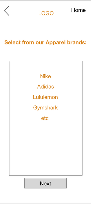
Using the Partner Product Portal


Viewing Account Settings, Demographics, and Accessibility Settings


Your Metrics and the Animation for All Goals Achieved


Responsive Design for iPad or Tablet

Takeaways
Obstacles
One of the main obstacles I had to overcome during this project was deciding what the hook of my app would be. I was aware that some workout apps included lots of different kinds of media in terms of health and wellness offerings, but I noticed that I hadn't seen any which included physical products. This was the market gap I looked to capitalize on, products to empower users as they move along their health and wellness journeys.
Opportunity for Growth
I feel as though some of the colors, especially the darker ones, could have been more evenly dispersed throughout the app's screens. I couldn't quite figure out how to unify that quality as much as I may have wanted, this time around.
For the Future
Moving forward, in addition to working in more of those darker hues, I would want to continue to build out the rest of the app. As this project took place in only about a week, I focused more on designing particular user flows than every single screen.
Thank you for checking out this case study!
If you'd like to get in contact with me to collaborate, share feedback, or just to connect, send me a message here:
bottom of page